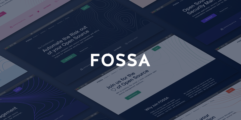
Some months ago, I met with Kevin (our CEO), and we discussed the idea of updating the FOSSA brand. There was this need to not only make it look better, but to send the right message out to the world, specifically to our users. In particular (and to start with), we wanted to focus on FOSSA’s website.
Sure, a corporate website conveys valuable information about the product, features, price, and company and is the main place companies demonstrate their brand identities. But the website is also the front door to your business. And by going through that door, your customers and potential customers can not only find the information they need in the most convenient form, but they typically also take the first steps toward using your product and deciding if they want to stick around as a customer.
In other words: A well-designed, informative, and updated website adds credibility to your business, strengthens your brand, and is the primary channel to your product. Those are the guiding values we applied to redesigning the FOSSA corporate website.
Meet the Team
Behind a project like this one, there’s usually an entire team. By the time I joined the company this winter (👋 hello from Buenos Aires, Argentina, where our seasons are the opposite of San Francisco, where FOSSA has its headquarters), Ryan (VP of Marketing) and Gauthami (Sr. Product Marketing Manager), had also just come onboard. Together, we divided our assessment into two main topics:
What was wrong with our website?
😖 It didn’t accurately reflect the company’s current positioning and products
😩 It was very hard to find through organic search
🤔 The journey was unclear for each persona or audience type
🥴 It was hard to keep updated and make changes
What were our goals?
✨ Present new messaging and positioning based on value and benefits to customers
🌈 Allow various personas to easily navigate the website
🤓 Provide our prospects the information and education they need
💪🏻 Make it easier to change and add to content, including expanding the overall scope
🎊 Optimize our website for discoverability and SEO
First Things First: Design Principles
As a starting point, and in order to maintain focus across this project, we set design principles or keywords that would guide us through this process. Whether they’re high-level and universal, or they’re specific to a project or product, design principles have the power to unify all the collaborators around what is most important to us and our users. These keywords helped us understand how we wanted FOSSA to be perceived:
🛡 Secure and Trustworthy
We want users to trust FOSSA as their open source management and policy engine solution, from the moment they arrive to our website and across the whole customer journey.
⚫️ Minimalist
We stand for the usage of fewer design elements, flat design, fewer options and features, and tendentially less occupied screen space.
💪🏻 Bold
FOSSA’s design is strong in color or shape, and very noticeable to the eye.
🔍 Accessible
We care about all our users being able to have an equally great user experience.
We’re Not Starting from Scratch
FOSSA already had an identity, and we didn’t want to compromise or undermine the expectations of our existing users. We wanted to keep those elements that identified the FOSSA brand, but with a twist. So we started with the basics.
FOSSA Logo
The FOSSA logo is the tangible symbol of our brand and one of our most valuable corporate assets. This is part of our core brand identity, and we can find it in every touchpoint that users have with FOSSA (website, product, ads, social media, trade shows, etc).
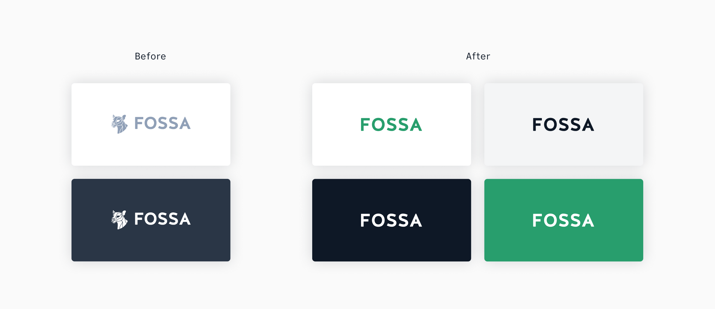
With the promise of keeping up with minimalism and simplicity, we removed the glyph from our logo to make it easier to adapt to different contexts and environments.
Color Palette
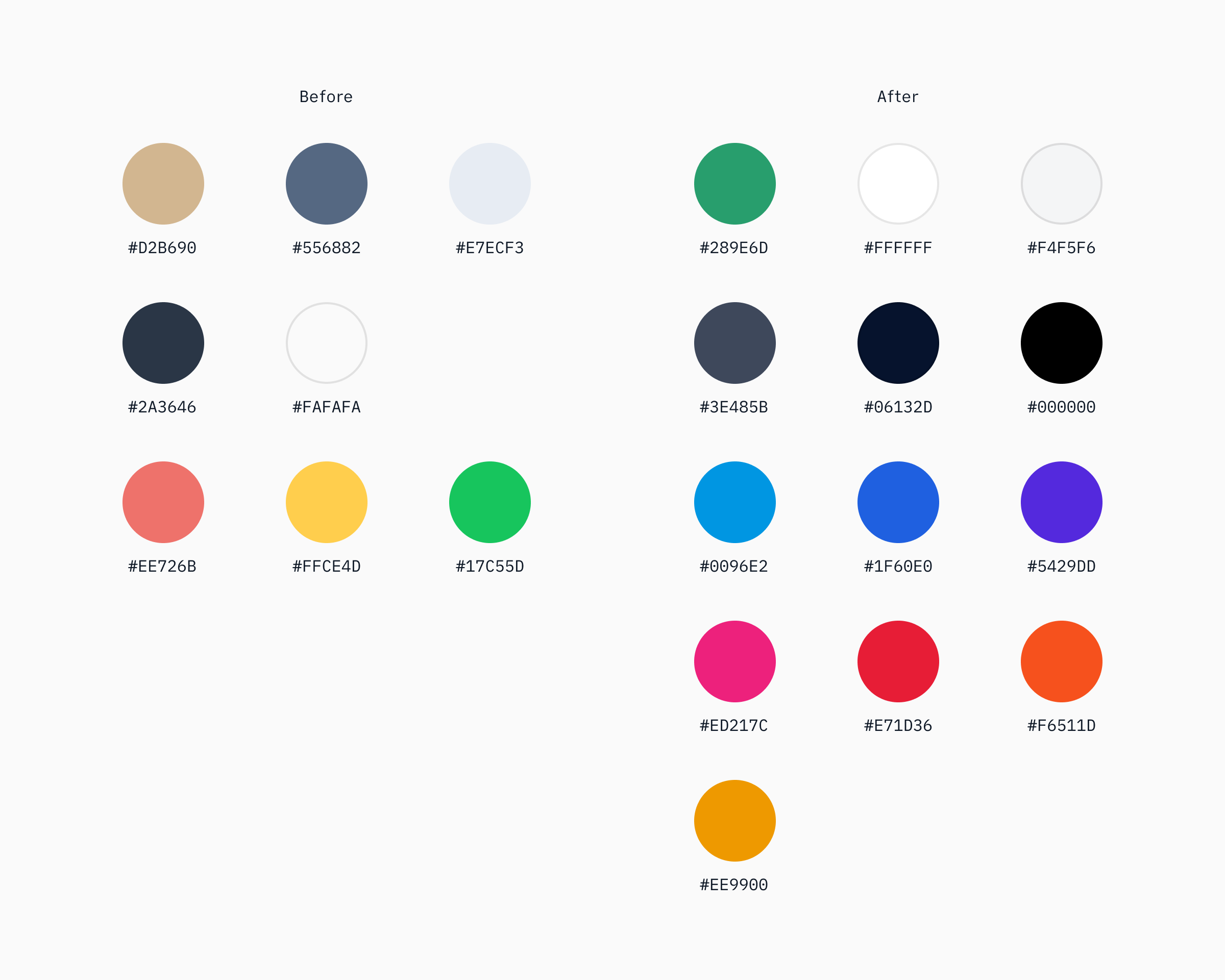
FOSSA’s main color palette included shades of yellow or gold, green, and blue. Once again, and keeping up with the premise of evolving, not recreating the brand, we modernized the primary color palette by using a brighter and more saturated version of the existing colors.
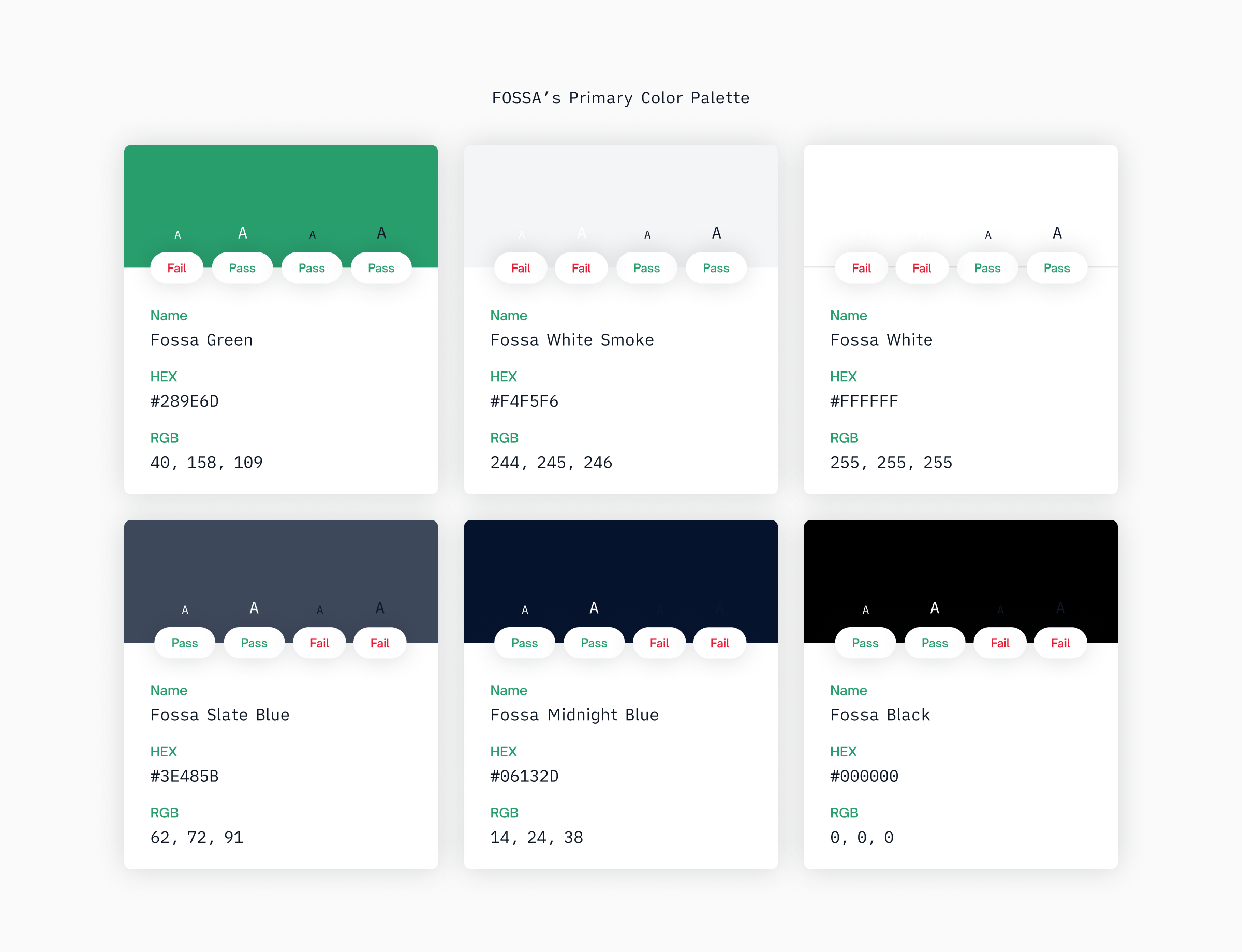
Our primary color palette includes neutrals, whites, and green. When combined in logical ways, these guide the eye and highlight important information or actions. We use FOSSA Green for primary actions, buttons, and text links. Neutral colors are primarily used for text and backgrounds.
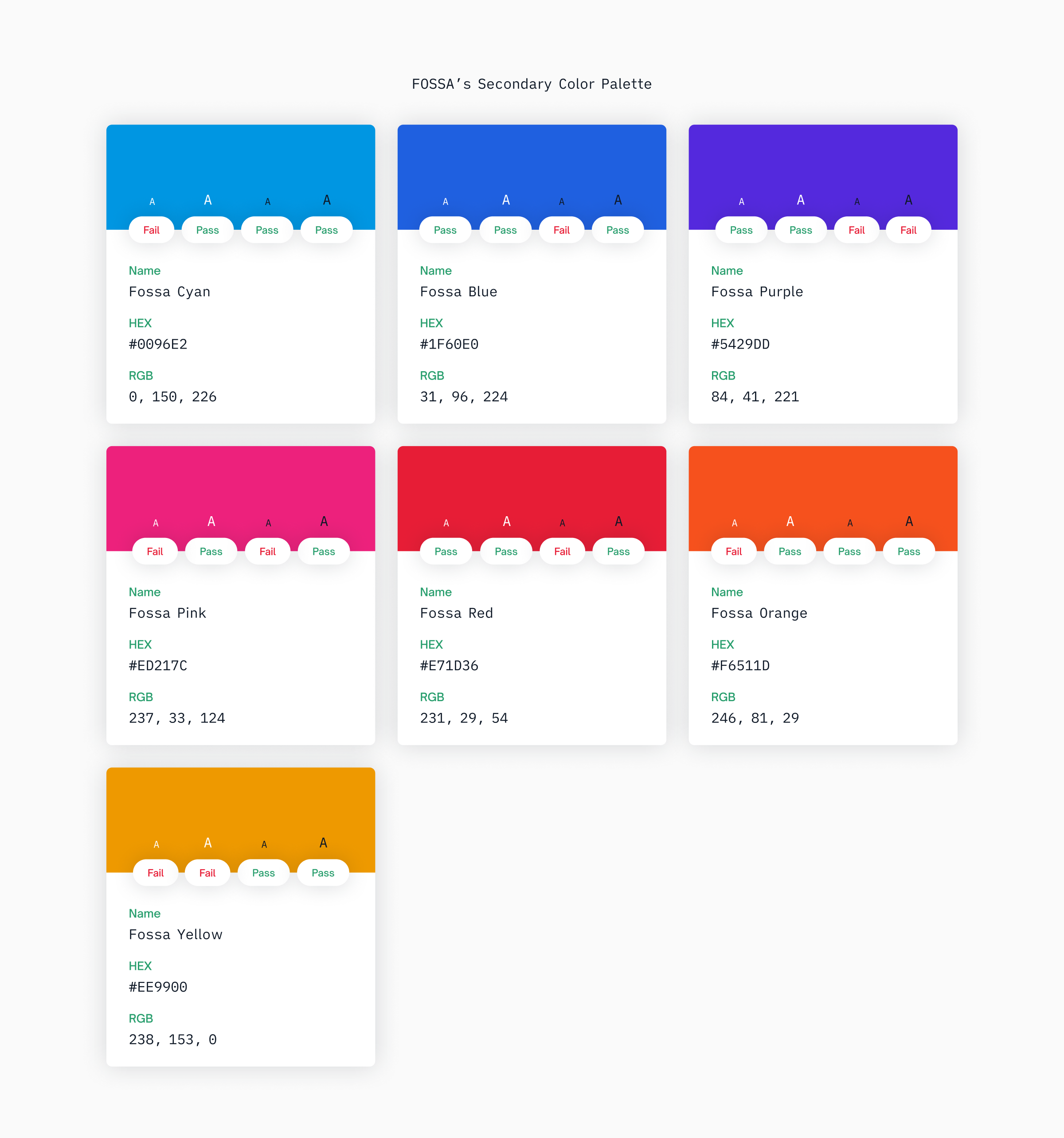
We also introduced a secondary color palette, which includes a variety of colors, to expand the boundaries of the FOSSA brand. You might find these in non-institutional pages and in the product, as well, to indicate actions such as status, help, or errors.
Each color is selected intentionally to provide meaningful feedback. When used in conjunction with our primary palette, these colors make every moment feel on-brand and every interaction informative.
Topographic Maps
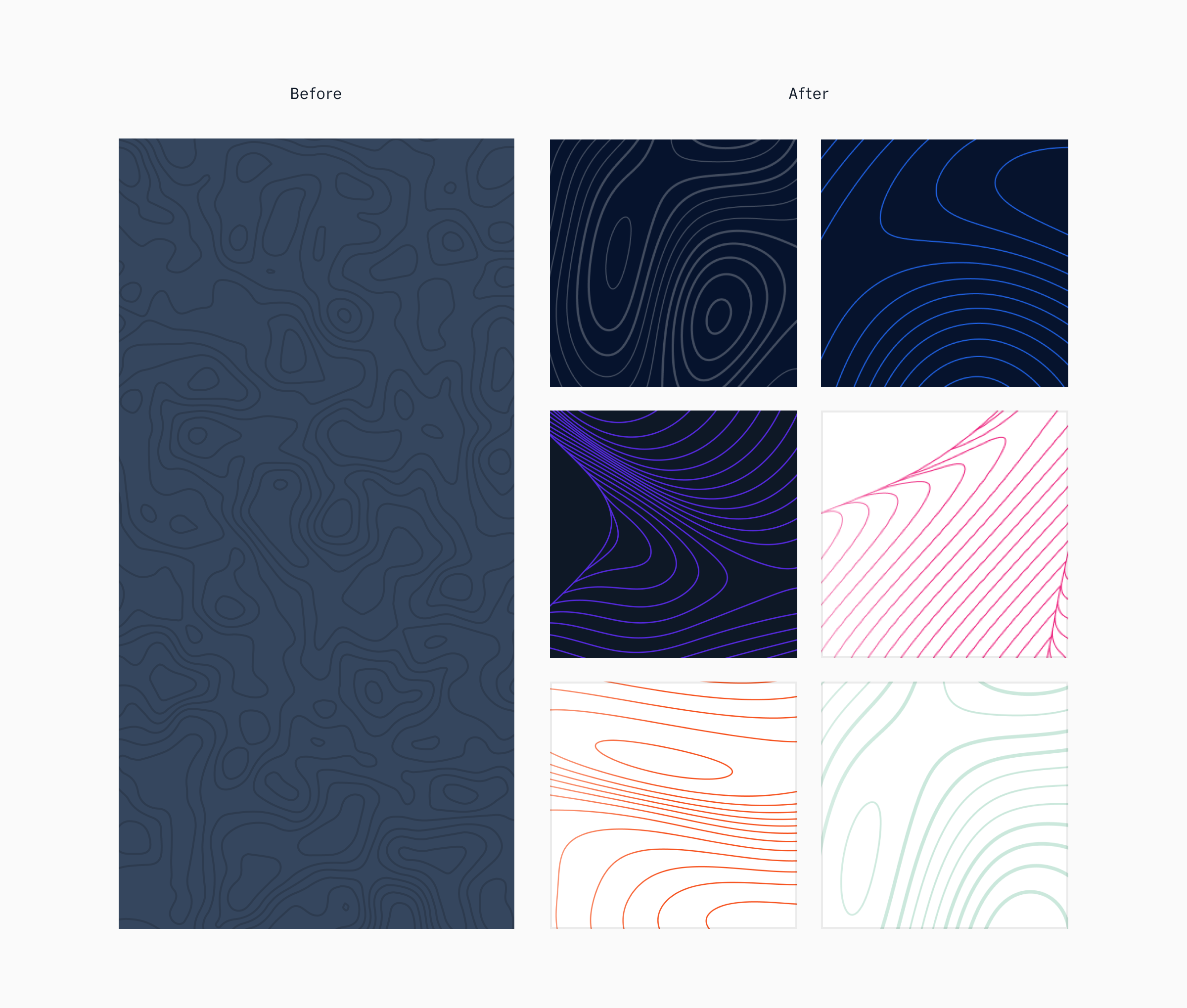
If you wandered around fossa.com in the past, you might have noticed that most of our hero units had a topographic map that complemented FOSSA’s aesthetic. In this case, we worked on creating multiple topographic maps (with different line heights and movements) that were used across the whole website. We also started to think about how this element could evolve depending on the page that users were visiting by changing its position, color scheme, and more.
Iconography
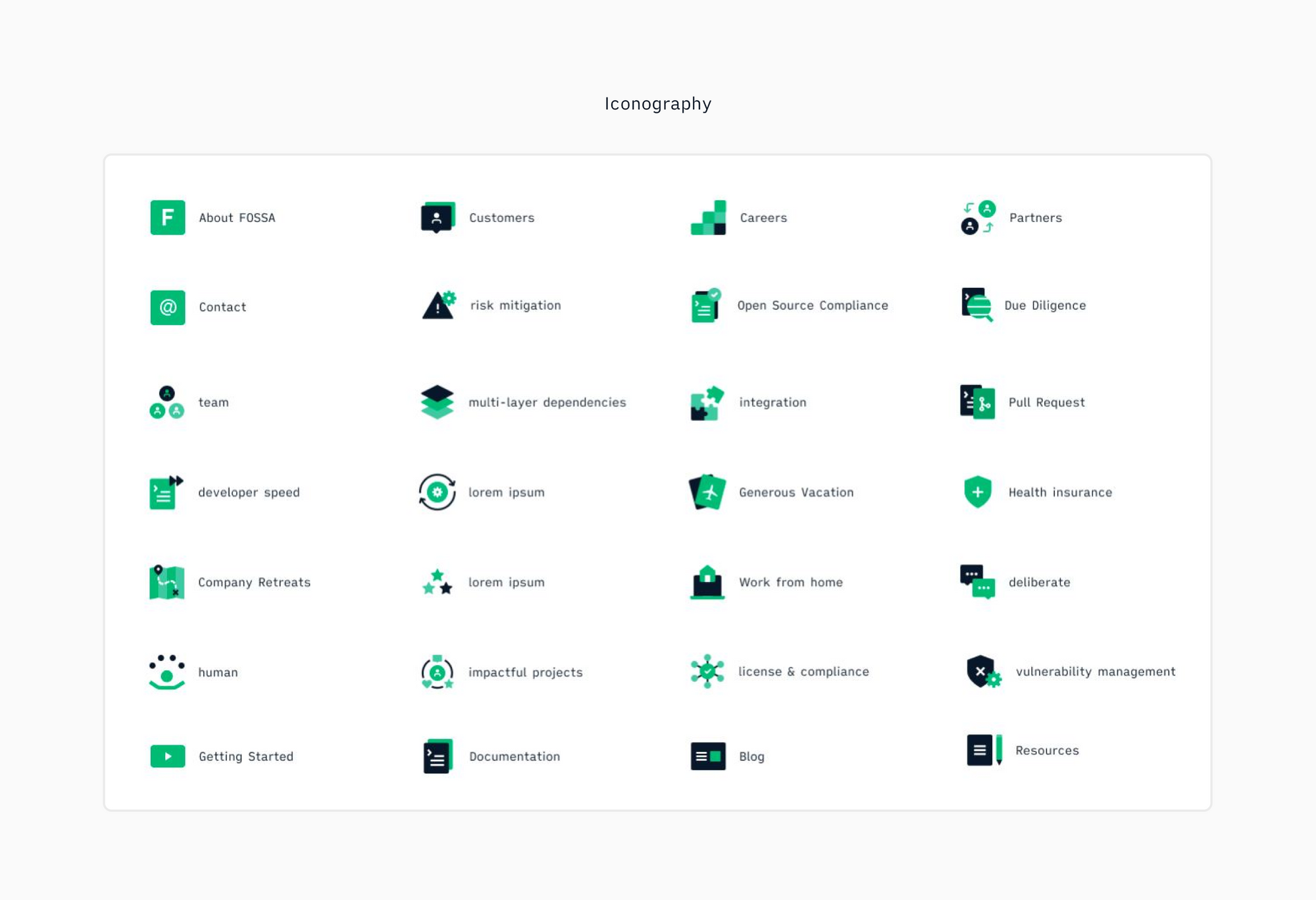
We had a set of icons in our previous website, but it was quite limited. So we created a new gallery to use in multiple scenarios across the different landing pages.
Something Borrowed: Typefaces
Working at a company whose priority is open source management means that we not only care about open source, we also use it as the cornerstone of our work whenever possible. With that in mind, we thought it’d be interesting to look for open source typefaces that could help us to not only leverage FOSSA’s messaging, but also identify FOSSA and give it a unique style and aesthetic, as well.
When searching for the right font family, apart from the idea of using something that was open source, we needed something that was not only easy to read, but also easy to adapt to multiple contexts. We needed to make sure that whatever we chose could work not only in digital environments, but in analog environments. We also needed typefaces that had broad language support.
Geometric sans fonts are clean, utilitarian fonts that work well in both print and digital mediums, making them insanely popular. We wanted to share a bold, impactful message across the website. We decided that a sans font would be used in our headlines, links, and CTAs. After searching and testing for a while, we found Open Sauce Two™, a typeface developed by Creative Sauce for their internal type system. It is a compact typeface that is optimized for better viewing small text on screen and in print. Open Sauce Sans fonts are under the SIL Open Font License and are actively developed, improved, and tested by the community.
Of course, the easy solution here would have been to use a single typeface across the whole website. But we realized that we were still missing something that could help us differentiate ourselves and make it easier to read in context, since users need to digest tons of information across multiple content properties, including documentation and blog.
I’ve been a huge fan of iA Writer for a while. It’s basically the simplest, most powerful text editor that I’ve ever used. Some time ago, their creators wrote a blog post about a new font family that they were introducing in their app, iA Writer Quattro. It was based on IBM Plex, but it simultaneously retained a lot of the technical virtues of classic typewriter fonts. Quattro saves space on small screens, and it looks beautiful. It offers a cleaner, more regular text image, ideal for use in paragraphs, body text, and quotes. Like Open Sauce, iA Writer Quattro is licensed under the SIL Open Font License.
The Website System
Once we gathered all the elements to settle the foundations of our brand, and after a lot of exploration, we finally began designing the layout of our website. We structured the different sections and pages based on a set of limitations we chose to ensure relevance and meaning in the brand and color palette.
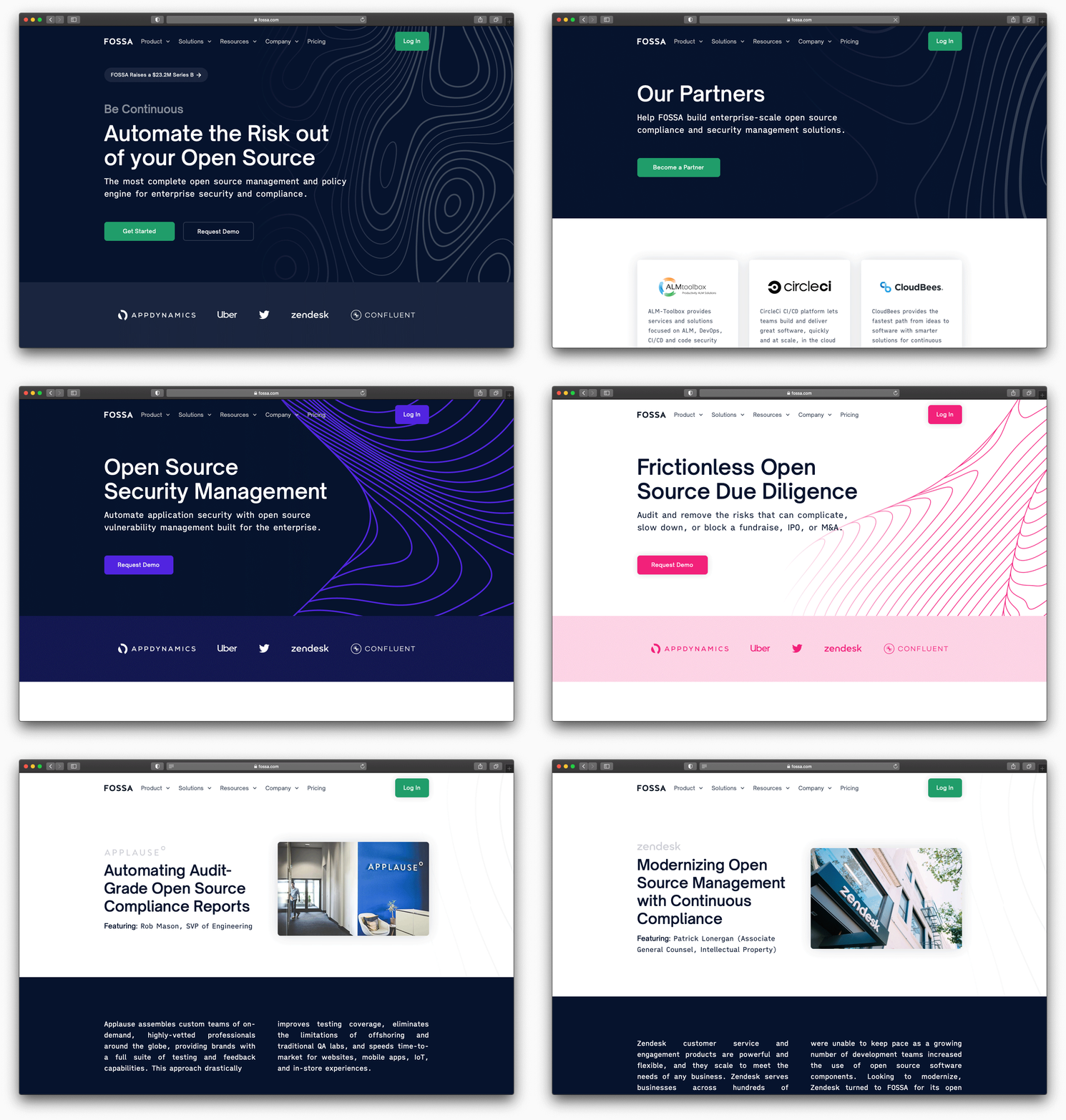
Institutional pages are the most restrictive, in terms of conveying what the brand is about, because they’re meant to share important information about the company, our value proposition, our pricing plans, customers, and partners. In other words: a cohesive view of the business.
Product pages follow the same path but, instead of using FOSSA Green as their main color, we used two different colors: FOSSA Blue for License Compliance and FOSSA Purple for Security Management. You can still relate them to the FOSSA brand, but they also have elements that distinguish them from each other.
We applied the same strategy to our solutions pages. The difference here is that we changed the base of the theme. Instead of being dark, and because of their tendency to be more text-heavy, they are light-themed to make it easier for our users to read.
Our case studies and careers pages are also light-themed to help with readability. But they go back into a restricted color scheme to reinforce brand awareness.
No-Code with Webflow
Plenty of decisions were made, but zero lines of code have had to be written (so far). When we arrived at this stage of the project, we realized it was time to speed up and start to implement our design.
Since the marketing team does not have any engineers, the question was whether to kidnap adopt a developer from another team or find a consultant to help us with coding and execution. Although we knew that the quality of the code in the website would be one way to demonstrate the engineering chops of the team that builds our app, we also knew from past experiences that if we wanted to make any changes in the future (no matter how big or small), we would have to rely on limited coding resources to do so while also competing with other product engineering priorities or waiting on an outsider with an unclear set of timelines and skills. And that would basically go against our stated goal of giving the marketing team more control, speed, and flexibility.
That’s when Webflow appeared!
Webflow is a SaaS application that allows designers to build responsive websites with browser-based visual editing software. While designers use the tool, Webflow automatically generates production-ready HTML, CSS, and JavaScript. In other words, and as they clearly state on their website, they envision a world where everyone can create powerful, flexible websites and apps as easily as they create documents today.
At first, I was sort of scared of jumping into a tool that I had barely used in the past and that I had only used on personal projects in my free time. But with the help of their amazing team, the most complete documentation that I’ve ever seen, and clear goals set together with my team (like what and how we wanted to approach phasing and timing different sub-results of the project), we not only made it through, we delivered a beautiful, manageable, and scalable website faster and at much lower cost than even we had planned!
Implementation Based on Blocks
One thing that turned out to be an advantage for us was my past experience implementing a CMS. I had learned that consistency comes easily from design work based on blocks. And that’s much of the logic behind Webflow.
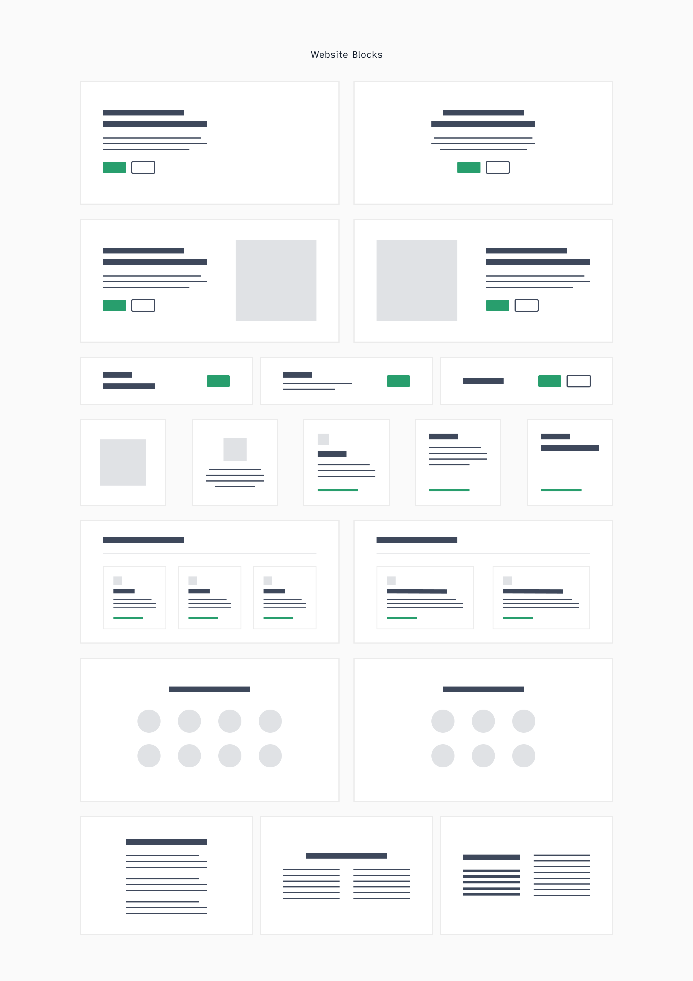
We’re basically thinking of modules like LEGOs that we can very easily reorganize and stack to create any number of new and different pages that still fit within the brand, since they use the same elements, colors, typography, and other design aspects.
Another advantage of blocks is fewer design elements and options, which makes things easier for designers, is more cost-efficient for the company, and faster for development because every net-new effort is meant for re-contextualization and re-use. It’s also flexible! Instead of always thinking about a landing page from scratch, you simply choose the blocks that suit your needs from an existing inventory.
Overall, the greatest advantages of a blocks-based approach is that you end up having a website that requires less overhead, is quick to launch, and can be easily modified to suit your needs.
The Result
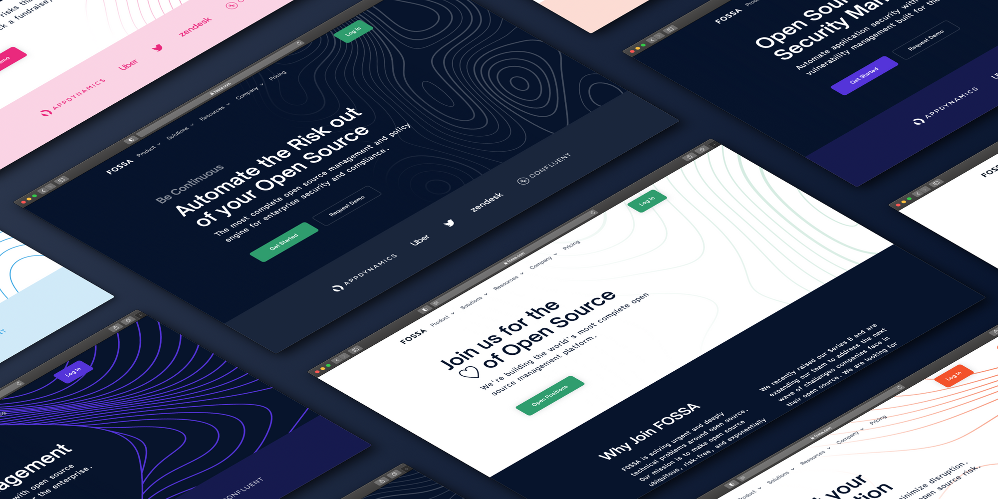
After less than three months of work and with only a relatively small squad of people consistently involved in the project, we can proudly say that FOSSA’s website revamp was a complete success. We couldn’t be happier with the results, but we’re also not ones to rest on our laurels. In fact, we’re already starting the next iteration and expansion of the website for next quarter.
But for now, don’t just take my word for it. Visit fossa.com and see the difference with your very own eyes.
